I co-founded AirHero to provide mass-scale, fluid, and recurring donations to great causes.
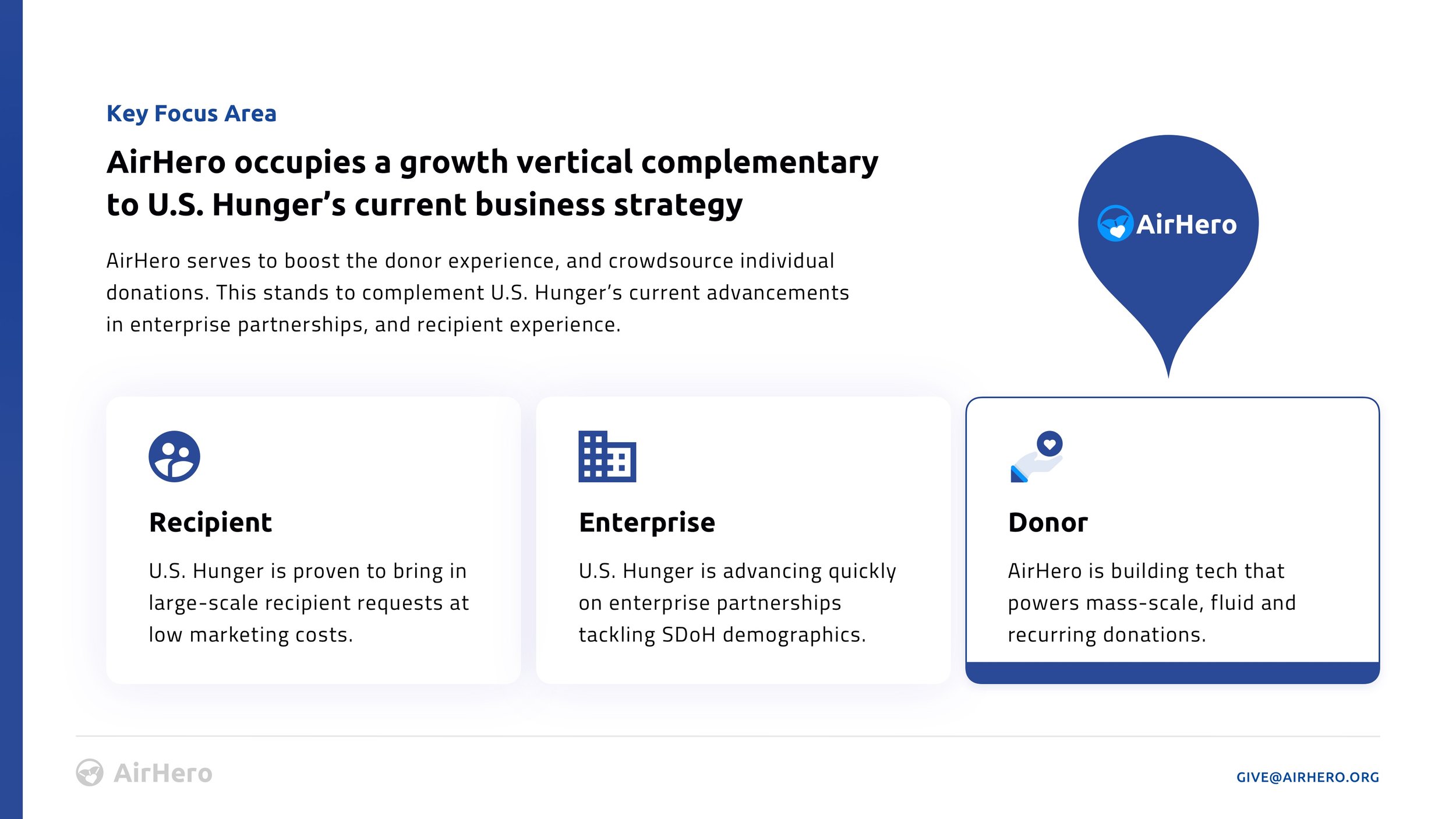
Current Stage: Pre-Alpha Giving that’s as simple as subscribing to your favorite streaming service. AirHero is a mobile app that serves to boost the donor experience, and crowdsource individual donations. It allows consumers to learn about areas of need, and find realtime metrics on social determinants of health. This helps individuals see exactly where hunger lives in their communities.
Team AirHero was co-founded by Andrés Aranguibel (CEO), Christian Whitted (CTO)
My Role as Co-Founder
We started this idea with the leanest team imaginable: a designer and an engineer. As co-founder and CEO, my role covers a few areas:
Design, documentation, and prototyping of the mobile and web platforms.
Design and development of the brand materials and marketing website.
Company formation, investor documentation, sales and marketing pitches.
Our Team
AirHero was started by a team from Disney, Google, Northrop Grumman, and AAA. Our backgrounds range from Media Production and Creative Direction in technology, to Backend Systems and Cloud Infrastructure.
Our Vision
Donating should be as transparent as the streaming apps we subscribe to, and as trackable as the items we purchase from Amazon. Our vision is to provide end-to-end visibility for meal donations – from order, to shipment and delivery.
The Partner Platform
AirHero HQ is the partner portal that allows an organization like U.S. Hunger to track new donations, understand their donor demographic, generate new campaigns, and fulfill orders from a custom-tailored dashboard.
The User App
AirHero Donor is the front-end user experience that allows a consumer to directly transact with the U.S. Hunger partner APIs. It pulls geographic data on areas of need, and receives funds allocated to specific donor-selected regions.
The Partner Model
Much like popular crowdsourcing platforms GoFundMe and others, AirHero is designed to drive revenue from launch by adopting a transparent, add-on fee to every donor transaction.
Case Study: A Partnership with U.S. Hunger
Design Process: Wireframing the User Experience
Each view in the app flow was sketched, designed, and tested first in a series of Sketch and Figma prototypes before development handoff


